Pandora’s Box: The Last Province’s Review System
In the old RPG magazine, The Last Province, they used a standard format for their reviews, based around a 6 categories with each getting a score out of 6: Writing, Art, Usefulness, Playability, Production, Value. To start off a series of random thoughts on old RPG products (purchased on a rainy June day from Glasgow’s Static Games), I am going to review that review system.
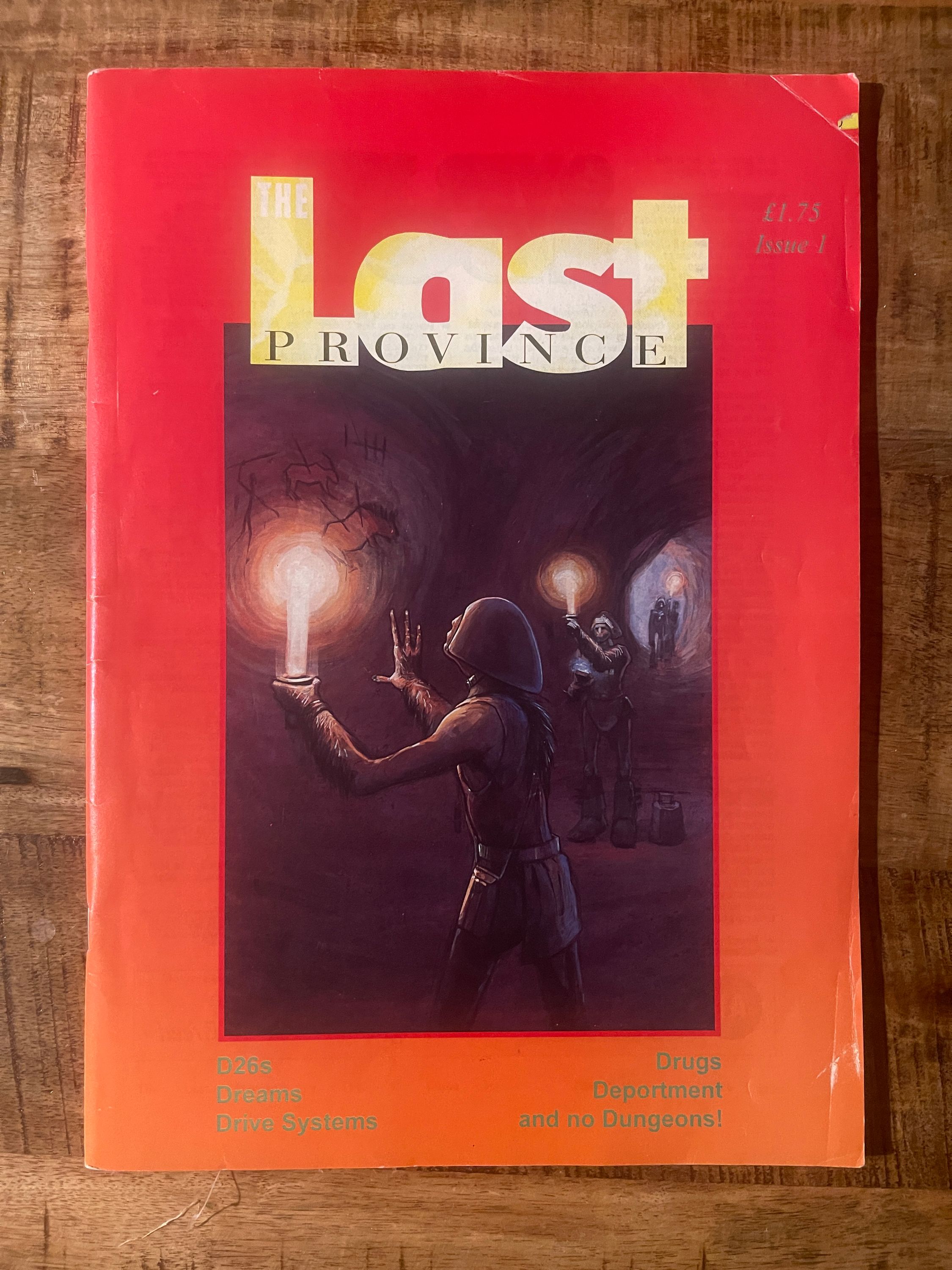
Here is the review system. It is applied to games, campaigns, and even dice in the first volume that I picked up.
- Writing: how well the book is written, not only in terms of attractive prose, but also how clear it is to follow.
- Art: not just the quality of illustrations but how appropriate they are.
- Usefulness: the value of the book out of context of its game system.
- Playability: describes how well the game works, either in terms of system or scenario plotlines.
- Production: whether or not the game will fall apart in your hands and how good it looks
- Value: can you live without it or not?
Usefulness
For me I really like the inclusion of usefulness in a review system. There is something accepted across the reviews that they are not being written for system adherents or fans. So many different products are reviewed and each is treated as interesting or potentially valuable in their own right. There is little to no comparison to other games in the reviews and a refreshing absence of acronyms and labels (ah, the past). Obviously there are unspoken assumptions of what types of games people play, but it feels as though the core of the reviewers is that people are playing before they are playing a style/system/genre etc.
Some ways this is used in Pete Strover’s (the production designer for the magazine) review of Tales from the Floating Vagabond (which has a recently released sequel). The reviewer loved it, giving a 5/6 for the writing and playability but only a 2/6 for usefulness. This is because of the setting’s chaotic gods mean ‘the laws of reality tend to get used like Plasticine, being kicked into the required shape whenever dramatically appropriate. The game system copes fairly well with all this… When the universe turns a blind eye to the players antics, the system does too.’
In this Strover seems to think that you need a free flowing and quick system to help handle the chaotic nature of these warring gods. Without that the product is less “useful” for someone looking for materials for their, say, Call of Cthulhu game.
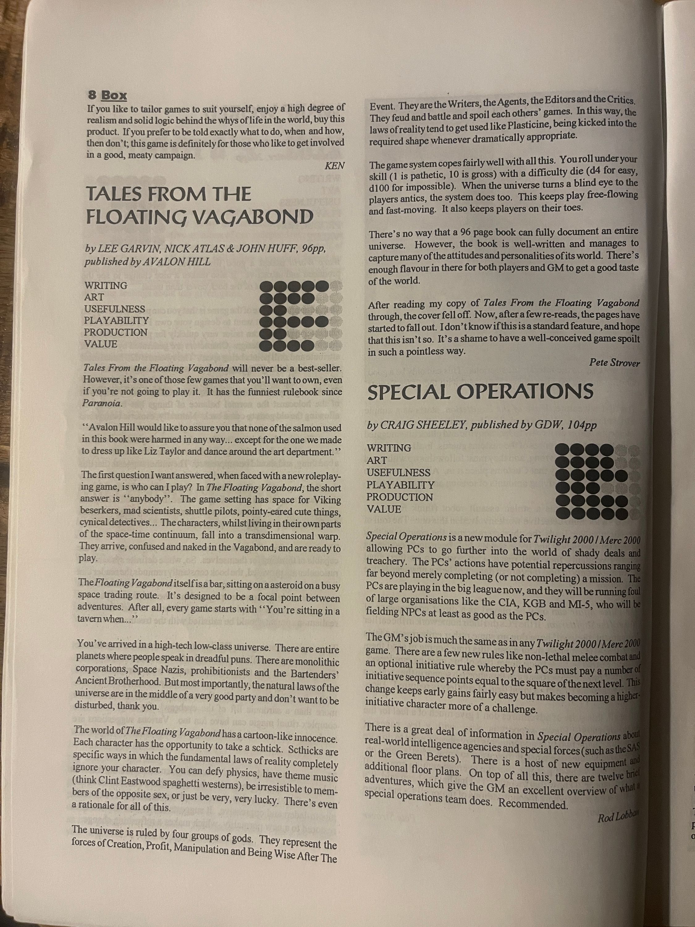
A review that gives a very high usefulness is Angus Boylan (The Art Editor, which is praise - the art is great in the magazine) who gave Werewolf - the Apocalypse a 6/6 for usefulness. The main reason seems to be that, in reading this, Angus discovered that he is Team Jacob, and likes werewolves more than vampires ‘or Leeches as the lupines call them’. In other words, the world that the game provides about these different creatures is so useful as to make any system almost irrelevant, and of that he gives only the briefest of allusions to.
The usefulness seems to be a measure of the “worlds” focus in any given text. For instance, the system-oriented Mythus gets a 3 for usefulness. This is a catgory I can get behind.
Art (over Writing?)
One of the things in reading through this magazine that I had cognitively known, but not fully felt before, was the impact of art. This review system’s mention of the ‘appropriateness’ of the art somehow struck a chord. This came partly from the review of Mythus Magick, the spell book for the newly released Mythus.
In this review, lupine fancier Angus Boylsn, talks about the spell descriptions as ‘usually dry and described in terms of game mechanics rather than how the spells are cast, and the rituals performed.’ This is coupled with ‘hardly any artwork to break up the monotony of page after page of spells.’ It gets a 2/6 for art, and a 3/6 for writing. But what he does like are the ‘very minor details’ that describe how mages must behave (‘being naked, bathing in salt water, or being seated in a pyramid which acts as a magic accumulator’). It seems this evocation of the world is the thing that Angus likes the most.
The Last Province properly showed how art achieves that. A lot of the “articles” or games/adventures are descriptions of worlds and people (not unlike a certain short-lived zine), for example De vere natura vis by Kay Dekker, is an in-character letter from a wizard to their colleagues on the development of some magic essence. This is a large block of small-fonted text, but it gains woodblock-style prints by Mike Middleton:
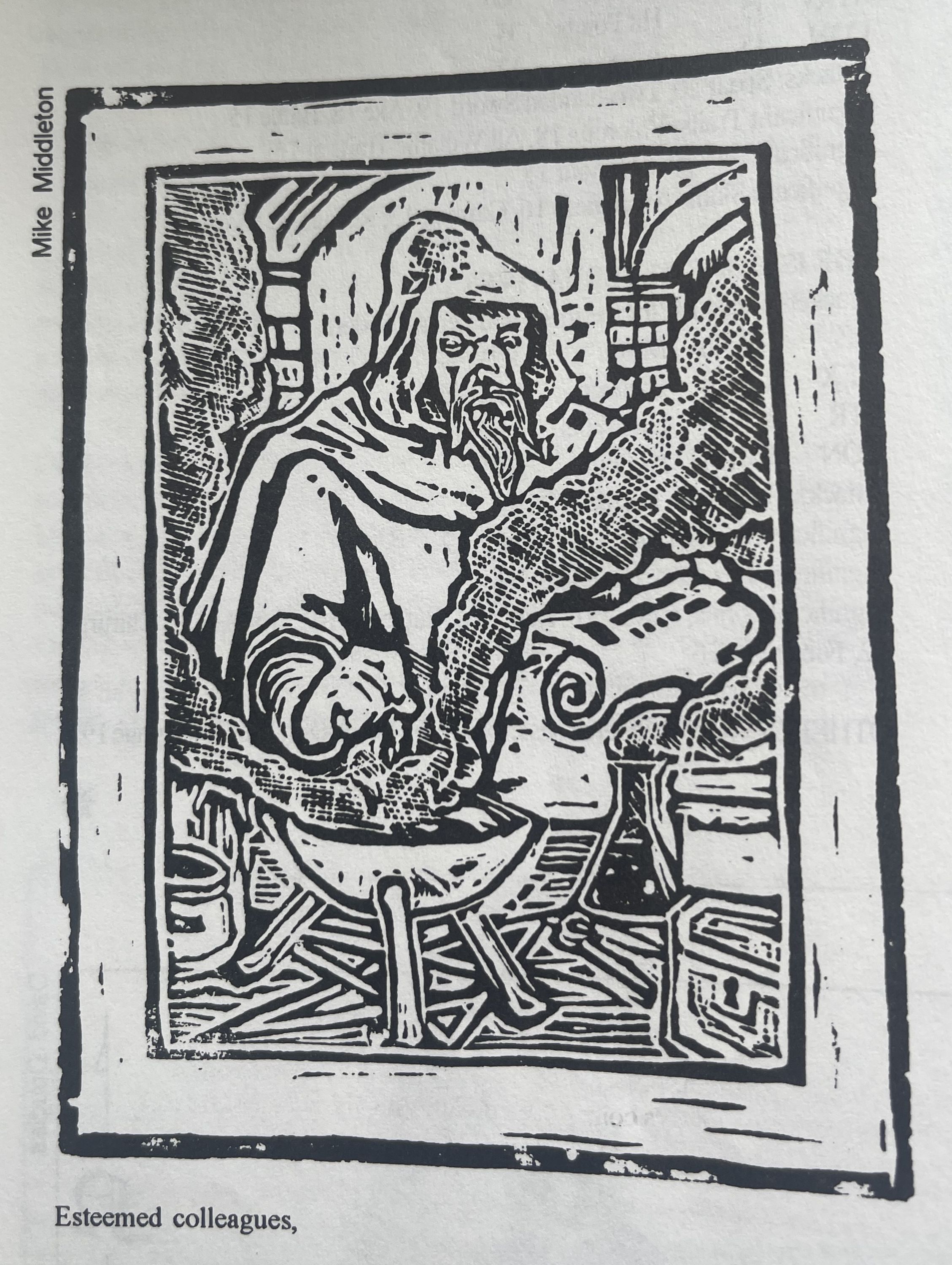 Call me a crackpot would you!?
The “game” here is the world, the art is the shortcut into the text and is its evocation.
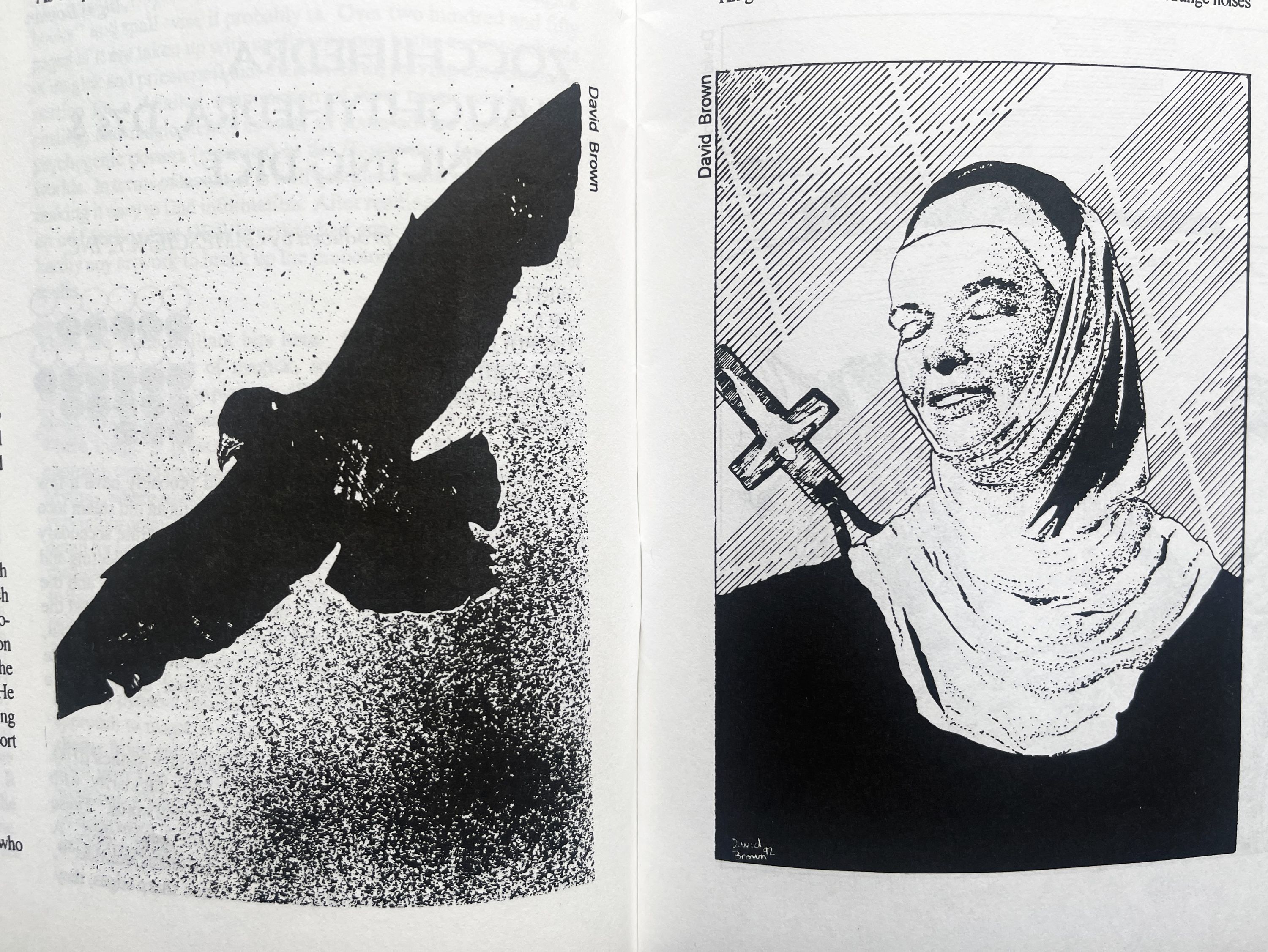
Another example comes from a scenario for Pendragon called And then there were Nun… by David Barras. This is a rather mundane adventure about knights escorting some young women to a nunnery. The magazine was published in 1992 and you can feel it in this adventure where the women are, um, not perhaps treated as well as they could be. At one point Isidore, in her husband’s armour, joins the knights: ‘if women of this type are common [i.e. female knights] play her as an intrusion, a needless weight around the neck of the party. They should be encouraged to feel protective towards her, in a typical patriarchal manner.’
Now lets look at the illustration of this character from David Brown:
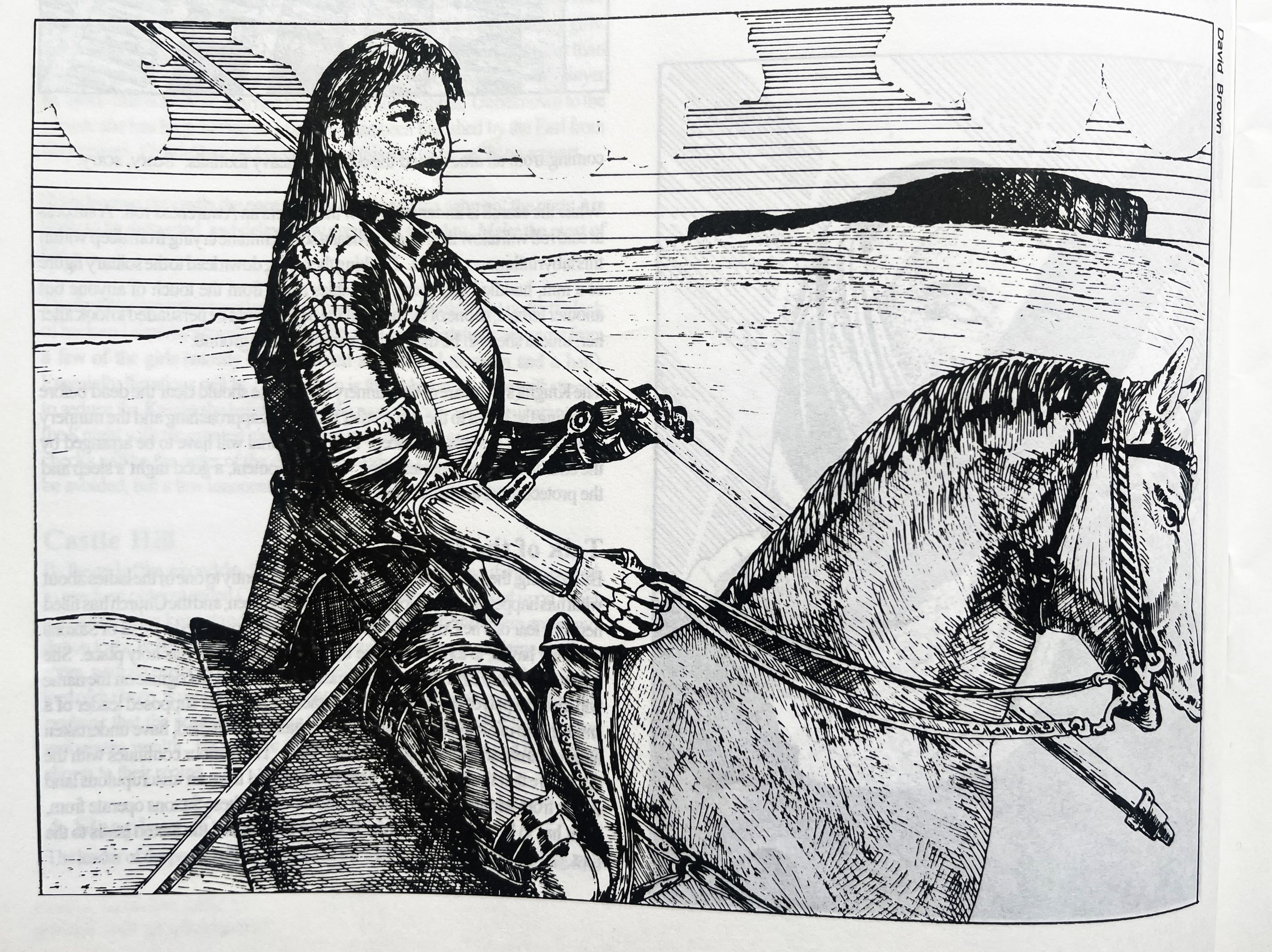
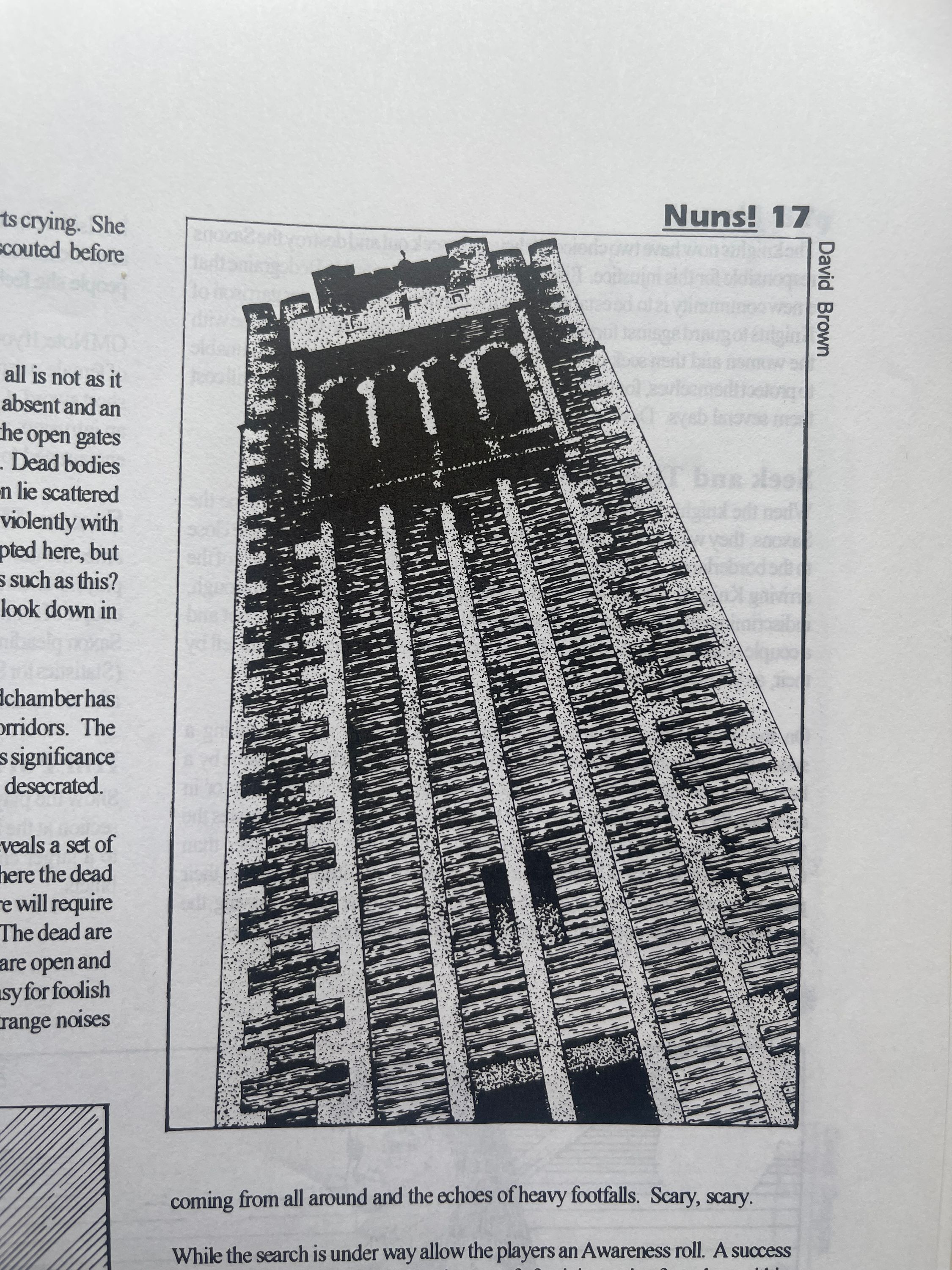
She looks like a fucking badass. Before I read the article I was like “this woman is going to be such a cool character”. The other art gives this really imposing sense of the darkness and danger of the scenario (the slaughter of a nunnery) which elevates the writing to something more. I personally feel that I could just take the pictures and run an adventure off of those and ignore the written adventure itself.
A sample review of And Then There Were Nun
- Writing: 2/6. Overlooking the sexism, the writing is fairly shallow though easy enough to read. It is both very rail-roady and not particularly evocative: ‘…strange noises coming from all around and the echoes of heavy footfalls. Scary, Scary.’ If you say so.
- Art: 5/6. A good range of images, from those evoking mood, others showing place and characters. There is also a pretty and simple map for one location. Another map or something similar would have been good for the nunnery, though the writing gives little inspiration for the reason for such a map. There’s also all this writing that gets in the way of the images.
- Usefulness: 3/6. The basic premise of the story would be interesting with a more nuanced treatment and more interesting motivations than “find the baddies, kill the baddies”. The art alone is what gives this its score.
- Playability: 1 or 4/6. It is a very simple adventure that if your players are used to very closely following only one route through a scenario would be easy to follow and lots of advice is given on how to get the players to the next scene. If your players in anyway want to scratch beneath the surface or take unexpected actions very little about the written adventure allows for that.
- Value: 1/6. The good part of the game is the art (and I have shown it here) otherwise, I wouldn’t hunt down an old gaming magazine just to get this. Though I picked up my £2.00 copy from Static Games and so having paid, I guess, 10p for its 4 pages, I can’t really complain.
Well there we go - maybe a useful guide for thinking about quality in RPGs, maybe, like most systems of evaluation, a way of dressing up subjective taste in the authoritative cloak of quantity.
Yours, The Wyrd
You can give me your thoughts, comments and follow what I’m doing on itch, twitter and tiktok!