Making a Medieval Manuscript Layout
I have been trying to develop a working layout which I can use to release bits of (the eternally forthcoming) The Wyrd Lands. This is a game inspired by the world of Old English poetry - of Beowulf, The Wanderer, etc. As such I want a layout inspired by the medieval manuscripts that capture this writing. This is a slightly challenging source of inspiration and in this post I am going to talk about my initial forays.
This is also a place for me to share a lot of links which might be the most useful thing in the post - just like an online recipe, they are at the bottom after the guff. A lot of these are taken from things people have shared on the NSR Discord, so thank you to those people.
A note on variety
One of the issues with anything about medieval manuscripts is that it can make you think they were a homogenous whole but really they occupy about 800 - 1000 years of production across the world (if you include non-European manuscripts). So there is a lot of inspiration to draw from and not a lot of consistency. If you want a glimpse of just how many there are, this database of digitised manuscripts gives a sense of scale.
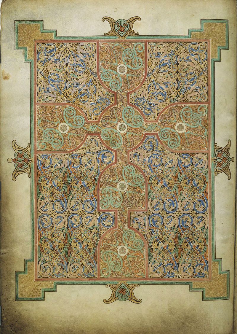
My particular starting point is the Lindisfarne Gospels, for the main reason that they were written around the time Beowulf was likely composed and they are stunning. They were once fully digitised by the British Library but following a cyber attack the entire collection of digitised manuscripts is unavailable.
The Layout
There are a great many layouts used in manuscripts. Here is a pintrest link to a selection that shows some of that variety. I originally wanted to follow the Lindisfarne Gospel which has a model of two columns with the right hand column slightly thinner than the first. This is interesting but it reads so oddly to modern sensibilities that I couldn’t use it.
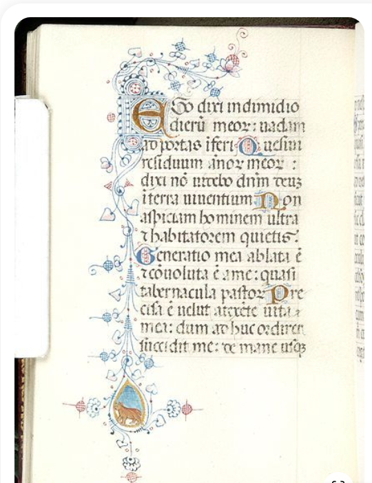
A lot of manuscript pages have quite large, often a-symmetrical, margins. This may have aided with holding the book but perhaps more interestingly it leaves space for annotations, comments, indexing and so forth. This is one of the most interesting parts of medieval manuscripts: their use over time and the fact that later scribes and users have added comments, explanations, tranlations and so forth. Therefore I decided I wanted a large margin on one side. Something like this 15th century book:
In order to figure out the proportion of the text to the margins, I wanted to use some kind of grid system. The layout for these books was very carefully designed and developed. In some cases it may have been following principles that have been lost and (potentially) reconstructed. These are the so-called canons of page design (explained well here). However, I didn’t just want to use one of these and be done with it - both because they didn’t give me the look I was going for, and I think the actual historical reality of them is pretty dubious, I found very limited mention of them in academic writing on manuscripts.
However, the mathematical element of manuscripts is they build on is obviously valid. There is a grid system underlying a lot of medieval manuscripts (even where it is broken), such as in this example:
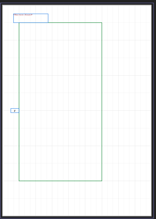
In some cases this sees image and writing wrapped around each other in ways that today would feel baffling to read. I spent a bit of time looking at the grids of some manuscript pages, but just fell back on working in 3s. So I split my page vertically into 12 and horizontally into 9. The margins are 1/9 on the left (outer), 1/12 on the top, 2/12 on the bottom and 3/9 on the inner. Which looks like this:
I might end up changing this but for the time being I like it.
Paragraphs and Headers
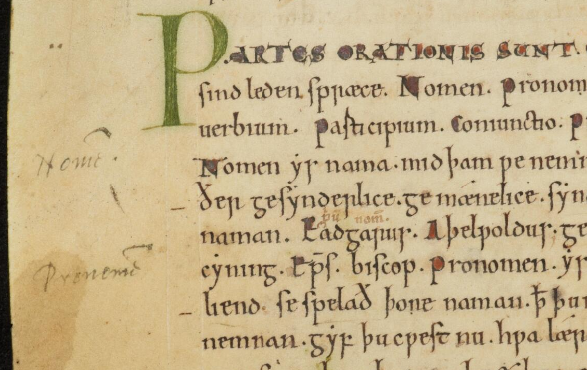
One of the big challenges for taking medieval manuscripts as an inspiration is the fact that standard ways of showing paragraphs and headings are different from today. Let’s take for an example this page from the Moore Bede from the early 8th century:
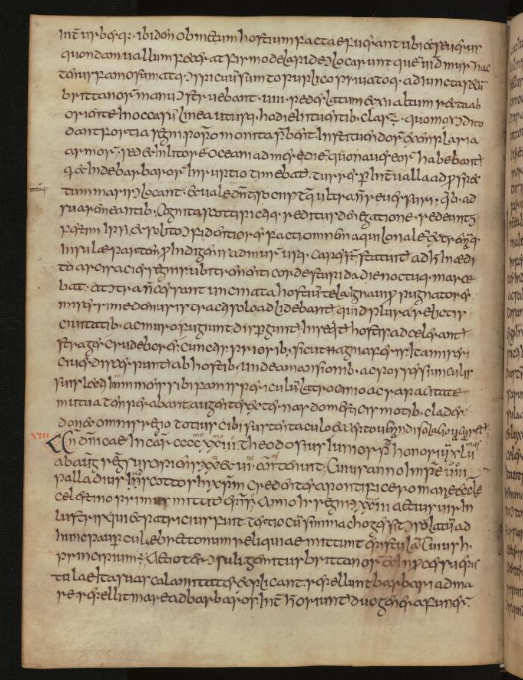
This is the marker for a new paragraph (I think)
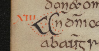
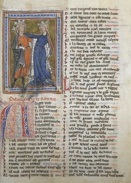
Another pair of examples from the late 11th century:
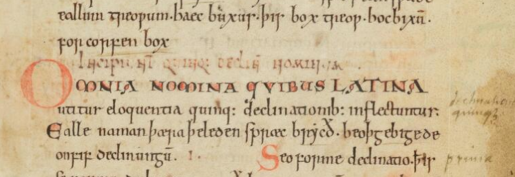
Which become the much more elaborate designs we often think of as in this 14th German example:
Now in my own writing, I need a nice line break between paragraphs, normally I don’t even like an indented paragraph (itself an interesting left over from manuscript production). So I keep a line break between paragraphs. Therefore I am indicating a section, rather than a paragraph. The most commonly used way of doing this seems to have been with the initial character or with the initial line. Typically with a colour difference, font or size difference, offset, or with the use of an illumination.
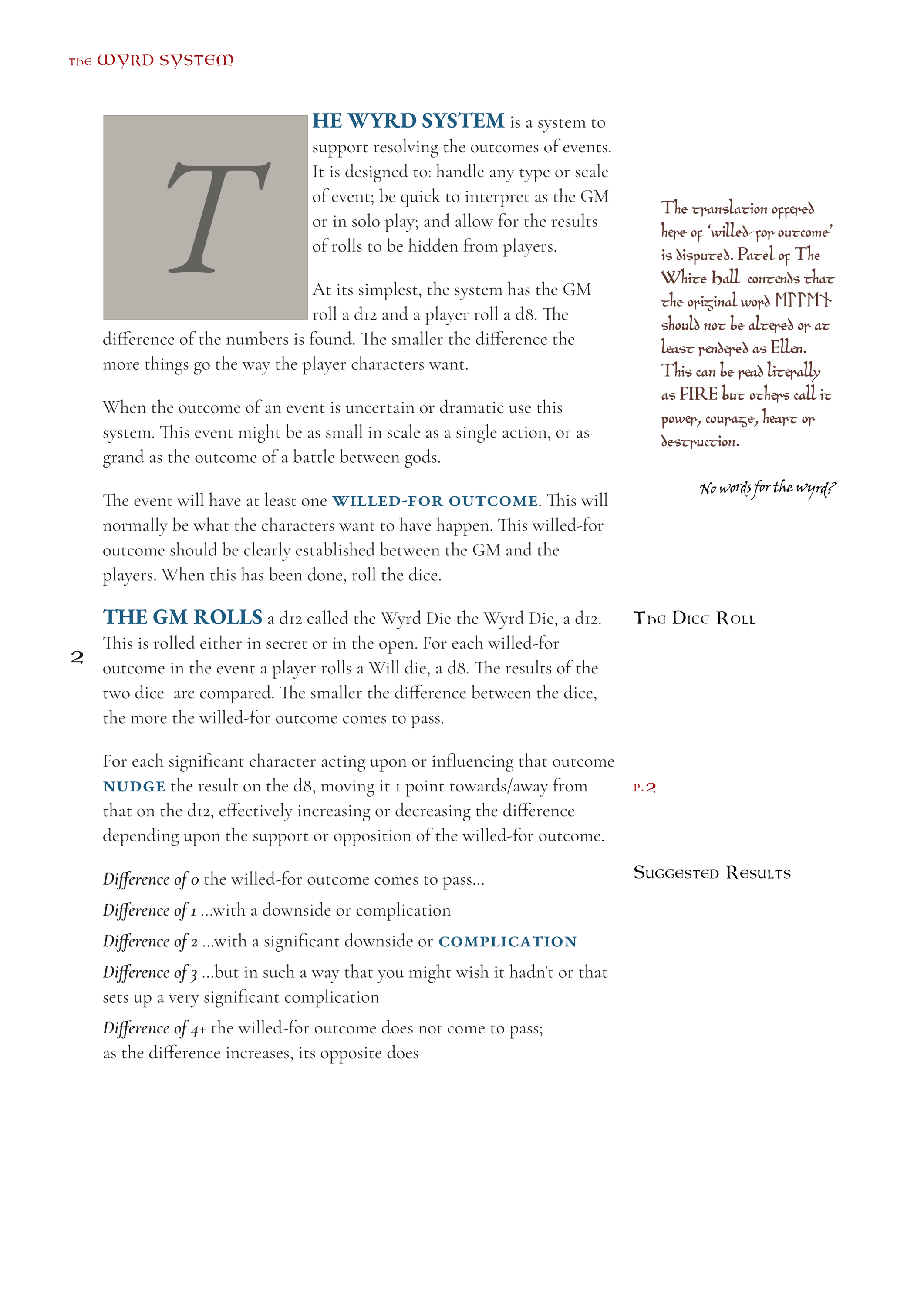
I have been a bit stuck on this but this is where I have settled:
I have tried with a sort of initial character, but I think it gets lost on the page and doesn’t clearly indicate change enough to a modern audience used to headings.
One of the challenges here is with balancing the fonts, and the additional use of an “annotation” almost functioning as a heading.
Fonts
Ah Fonts, the never-ending well of decision-making. We have got a number of fonts to think about here: the body; the “heading” or bolding fonts used to mark sections; and (multiple) annotation fonts.
The body font has to be a relatively modern font and I have just followed my own tastes witha light serif font. The one I am working with is Cormorant Garamond, though I may switch to Elstob partly because it can handle medieval characters. Anything that looks any more “historical” just impacts on readability.
Because of using a modern font for the body, selecting a font for the “heading” is tricky in that the historical fonts look older than the modern, even though they are supposed to be later additions. For the initial character, I have taken the initial font from the exter book, which is a truly fantastic set of fonts that I am also using in the annotations. However, as before I don’t think I will use this as it just doesn’t match modern tastes.
For a while I also switched between Uncial Antiqua and Lombardic. The issue with using both of these fonts is that they look so different from the body that they feel disconnected from it. They have to be different from the annotation fonts as they were written (theoretically) by a different scribe. However, using a historical font for the heading clashes with the ones used in the annotations. Therefore I have just settled on a bolded form of EB Garamond, which gives a heavier weight but is still obviously written by the “same hand”. I’m not fully satisfied with this but it’s enough to start working on.
Annotation Fonts
The annotation fonts are theoretically coming from multiple different scribes. The first “The Index Scribe” went through and put useful notes to aid the reader in going through a text. There is an interesting video on discontinuous reading which is something I want to work with and this kind of annotations works to do that. We can example of this here:
This kind of work seems to be typically done in handwriting as some later user has put this in for the contemporary users of a book (in the image below you can see where a later user has put in page numbers, it looks like in pencil). However, I want this to support the function of being a “heading” in the text and nowadays this style of font, the looser more handwritten, essentially means ‘less important’. Therefore, I wanted to use a historical font which that still looks like a heading for a modern reader.
This takes me back to Uncial Antiqua and Lombardy. At the moment I am settling on Lombardic because it has a lightness that fits better with the page. However the Uncial is closer to the font of the Lindisfarne Gospels and does also look more like a modern heading.My initial draft of this was just a pretty standard structure with subheadings using this. It looked good (maybe better!).
 Lombardic Annotation
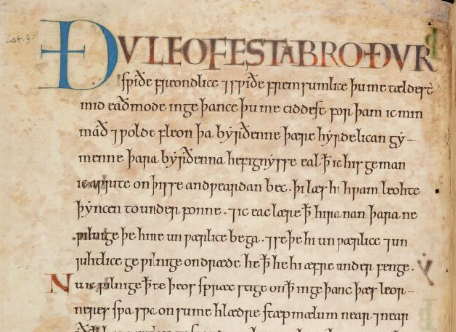
The second annotation that I am using is replicating the idea of ‘glossing’ where a later scribe has come in to explain, translate, or comment on an original manuscript. For example:
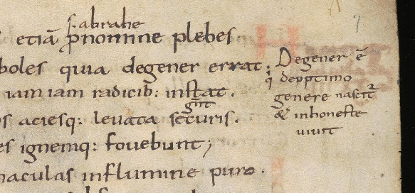
For this I am using the font called BeowulfOT. This is version of the text from the Nowell Codex which has the right look but doesn’t include the long S or r of other facisimile fonts like EBH facsimile and Pfeffer Medieval. I love this font.
Colours
The use of coloured writing is called ‘rubricing’ which literally means “reddening”. I have however decided to use a blue for the headings. Rubrics didn’t only happen in red, blue and green seem common as well. Red also looks like a grey in a lot of cases of colourblindness (you can check this on this fascinating site) whereas blue stays mostly blue and so may standout. For the indexing I will use red at points because it doesn’t need to contrast with the text around it, so it becoming grey doesn’t matter.
I’m also probably going to put the annotations in different colours to help them stand out as not being written by the same hand.
Page number, Tables and Lists etc.
I have put the page number in an odd position in the middle of the outer margin. This is the position for the first ever printed page number (which came in very late). I’m probably going to repeat it alongside the section title in the top margin, just to help with readability.
I haven’t done too much with lists etc. I am probably just going to keep them fairly standard and modern as, along with the rest of the body it needs to be readable. I’ll probably try to do something prett for the table.
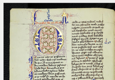
Illuminations
At some point I will have some dedication illuminations for initial characters for chapters, margin illustrations, borders and so forth. But that is time and money down the road. My working style for this will to combine elements of framing and composition from later medieval things, but using the images and patterns of anglo-saxon or celtic art. I want some marginalia and doodles as well. Here is a very rough example:
Conclusion
There we go, this is an endless pit of thinking but an enjoyable one! Below are some of the links and resources that I have used (and will continue to do so). But this is a full page:
Manuscripts in general
- Nottingham University’s guide on how to research manuscripts which gives a lot of simple explanations of terminology etc.
- A nice libguide to manuscripts with videos, recommended reading
- Some videos from the University of Leiden giving a fascintating overview
Collections of Manuscripts
- A big repository of links to digitised manuscripts
- A pinterest collection of many different layouts
- The Cambridge collection of digitised Anglo-Saxon manuscripts
Layouts and decorations
- An overview of margins and the canons
- A short overview with examples of decorations
- An overview of the history of the pilcrow
- Summary of the first page number
Fonts
- A directory of fonts that handle a huge range of medieval symbols
- A second directory of historically inspired fonts all by Peter Baker, including the versatile Elstob
- Another example not part of this is Elstob
- A great set of fonts taken from the Exeter Book
- BeowulfOT, a font based on that from the Nowell Codex (Beowoulf)
- A ‘Golden Type’ font for a strong victorian-medieval look
- A site allowing you to analyse colours for colourblindness